Introduction
You need a small image. Not too big. Not too small. Just right. Something that fits neatly in a sidebar, under a button, or beside a menu link. You search for it. You find one. But when you upload it, it stretches. It blurs. It gets cut off. The problem is not your design. It is not your software. It is the size. You need a 150×30 image. But you do not know what that means. You do not know how to make it. You do not know where it is used. This guide will change that.
You will learn exactly what a 150×30 image is, why it matters, where it is used, and how to resize any image to this exact dimension without losing quality or spending time on complicated tools. No fluff. No jargon. Just clear, practical steps you can use today.
Quick Answer: What Is a 150×30 Image?
Short answer:
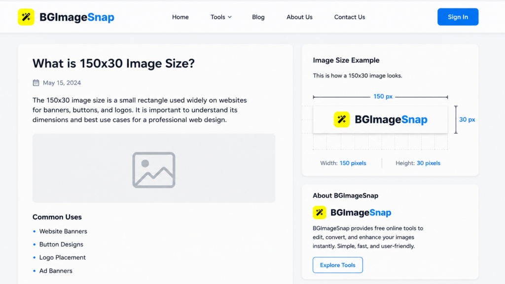
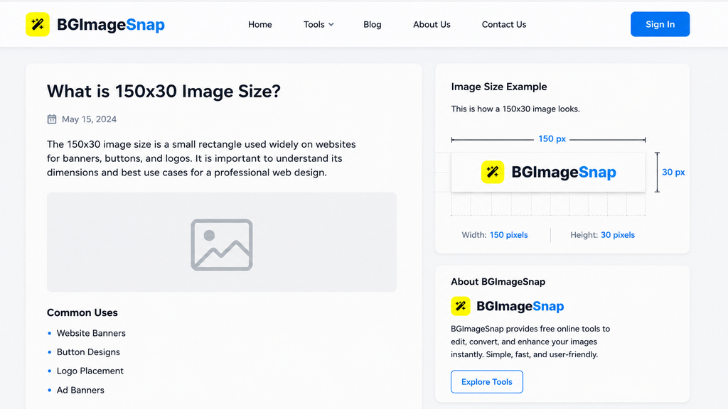
A 150×30 image is a rectangular graphic that is 150 pixels wide and 30 pixels tall. It is commonly used for small banners, buttons, and website elements that require a compact, consistent size.
Key Takeaways:
150×30 means 150 pixels wide by 30 pixels tall
Aspect ratio is 5:1 very wide and short
Used for banners, affiliate links, navigation buttons, and micro-ads
Must be resized correctly to avoid stretching or blurring
Works best with simple text, logos, or solid colors
This size is not arbitrary. It is designed to fit in tight spaces without overwhelming the layout.
What Does 150×30 Mean? (Pixels, Dimensions, Ratio)
Pixels Are the Building Blocks
A pixel is the smallest unit of a digital image. A 150×30 image contains 150 pixels across its width and 30 pixels down its height. That is 4,500 total pixels. This is not a measurement in inches or centimeters. It is a measurement in screen units. On a phone, tablet, or computer, the physical size of the image will change based on screen resolution but the pixel count stays the same.
The 5:1 Aspect Ratio
The ratio of width to height is 150 divided by 30, which equals 5. That means the image is five times wider than it is tall.This shape is called a “horizontal banner” or “leaderboard.” It is optimized for:
- Horizontal space (like top or bottom bars)
- Limited vertical room (like side menus)
- Fast scanning (users read left to right)
Why This Matters
If you stretch a 150×30 image to 200×50, the content will look distorted. If you shrink a 300×60 image to 150×30 without proper resizing, it will blur.
The key is to start with the right size or resize correctly.
Where Is a 150×30 Image Used?
This size is not common for photos. It is built for function. Here are the most frequent uses:
1. Affiliate Marketing Banners
Many affiliate programs require banners to be exactly 150×30. This size fits neatly in blog sidebars, footer sections, or within article text without disrupting the flow.
2. Website Navigation Buttons
Small action buttons like “Sign Up,” “Download,” or “Learn More” often use this size to keep menus clean and fast-loading.
3. Ad Units for Small Sites
On blogs, forums, or niche websites, 150×30 is a standard size for low-impact, non-intrusive ads. It does not distract but still draws attention.
4. Social Media Profile Badges
Some platforms allow small badges or icons in bios or comments. A 150×30 image works well for these limited spaces.
5. Email Signature Elements
Small logos or call-to-action buttons in email signatures often use this size to remain readable on mobile devices.
In all these cases, the goal is the same: deliver a message quickly, clearly, and without taking up much space.
Why Size Matters: The Consequences of Getting It Wrong
Using the wrong image size may seem harmless. But it causes real problems.
Problem 1: Distortion
If you force a 300×60 image into a 150×30 space, the software will stretch or squeeze it. Text becomes unreadable. Logos look broken.
Problem 2: Blurriness
If you shrink a large image without proper resizing, details blur. Sharp edges turn fuzzy. This looks unprofessional.
Problem 3: Layout Breakage
Websites and platforms often lock dimensions. If your image is too big, it may not upload. If it is too small, it may appear tiny or get cut off.
Problem 4: Slow Loading
Large images take longer to load. Even if they are resized later, the original file size still slows down the page.
Problem 5: Poor User Experience
Users notice when things look off. A stretched banner or blurry button makes your site look careless. The right size is not just about fitting. It is about respect for your audience, your platform, and your design.
How to Resize Any Image to 150×30
You do not need expensive software. You do not need to be a designer. Here is how to do it in three simple ways.
Method 1: Use an Online Tool (Recommended)
Go to a free, trusted tool like BGImageSnap.
- Upload your image.
- Set width to 150 and height to 30.
- Choose “Maintain Quality” if available.
- Download the new file.
This method works for JPG, PNG, GIF, and other formats. It is fast, safe, and requires no install.
Method 2: Use Your Computer’s Built-in Tools
On Windows:
- Open the image in Paint.
- Click “Resize.”
- Select “Pixels” as the unit.
- Enter 150 for width and 30 for height.
- Make sure “Maintain Aspect Ratio” is unchecked.
- Save as PNG or JPG.
On Mac:
- Open the image in Preview.
- Click “Tools” then “Adjust Size.”
- Uncheck “Scale proportionally.”
- Enter 150 for width and 30 for height.
- Click OK.
- Export as PNG.
Method 3: Use a Free App on Your Phone
Download a simple image editor like Snapseed or Photo Editor by VSCO.
- Open the image.
- Tap “Resize” or “Crop.”
- Enter 150 for width and 30 for height.
- Save and export.
Always save your resized image as PNG if it has text or sharp edges. Use JPG only for photos with no text.
Common Mistakes When Resizing Images
Mistake #1: Leaving “Maintain Aspect Ratio” On
If you keep this option enabled, the tool will resize the image proportionally. A 150×30 image is 5:1. If your original image is 4:1 or 3:1, forcing it to 150×30 with this option on will leave white bars or cut off parts of the image.
Fix: Always turn off “Maintain Aspect Ratio” when you need exact dimensions.
Mistake #2: Starting with a Low-Resolution Image
If your original image is smaller than 150×30, resizing it up will make it blurry. You cannot add detail that was never there.
Fix: Always start with an image that is at least as large as your target size.
Mistake #3: Saving as JPG for Text or Logos
JPG uses compression that blurs edges. Text becomes fuzzy. Logos lose sharpness.
Fix: Use PNG for any image with text, lines, or transparency.
Mistake #4: Ignoring File Size
Even a 150×30 image can be large if saved with poor settings. A 150×30 PNG should be under 50 KB. If it is over 200 KB, you are wasting bandwidth.
Fix: Use “Save for Web” options in tools or compress with free online tools.
Mistake #5: Not Testing in the Final Place
Upload your image to the actual website, email, or platform before using it widely. Some systems crop, stretch, or resize images automatically.
Fix: Preview it where it will be used. Adjust if needed.
Tips for Creating Clean 150×30 Images
Tip 1: Use Simple Designs
With only 30 pixels of height, complex graphics will disappear. Stick to bold text, solid shapes, or minimal logos.
Tip 2: Keep Text Large and Centered
Use a font size of at least 14 pixels. Avoid thin fonts. Center your text vertically and horizontally.
Tip 3: Use High Contrast Colors
White text on black. Black text on white. Dark blue on light yellow. Avoid similar tones like gray on beige.
Tip 4: Add a Border if Needed
A thin border (1–2 pixels) helps the image stand out without needing color.
Tip 5: Test on Mobile
View your image on a phone. If the text is hard to read, it is too small.
Tip 6: Save as PNG
PNG supports transparency and preserves sharp edges. Use JPG only if you need the smallest file size and the image has no text.
FAQ: Your Top 150×30 Image Questions Answered
1. What is the pixel size of a 150×30 image?
It is exactly 150 pixels wide and 30 pixels tall. This equals 4,500 total pixels.
2. Can I use a 150×30 image for a logo?
Yes, but only if the logo is very simple. Complex logos with fine details will not be visible at this size. Use it for brand icons or text-based logos.
3. Is 150×30 the same as 150 by 30?
Yes. Both mean width 150 pixels and height 30 pixels. The order is always width first, then height.
4. Why does my image look stretched after resizing?
You likely kept “Maintain Aspect Ratio” turned on. Turn it off and enter the exact numbers.
5. Can I make a 150×30 image from a photo?
Yes, but only if the photo has a clear subject. Crop the photo tightly to focus on one element. Avoid using full scenes they will become unreadable.
6. What file format should I use for a 150×30 image?
Use PNG for text, logos, or buttons. Use JPG only if the image is a photo and you need a smaller file size.
7. How do I make sure my 150×30 image loads fast?
Save it with low compression. In PNG, use 8-bit color if possible. In JPG, set quality to 70–80%. Aim for under 50 KB.
8. Can I use this size for social media?
Most social platforms require larger sizes. 150×30 is best for websites, emails, and blogs. Use it only if the platform allows custom banner sizes.
Conclusion: Precision Is Power
A 150×30 image is small. But it is not insignificant.
It is the difference between a clean, professional layout and a cluttered, broken one. It is the difference between a button that works and one that confuses. It is the difference between a user who stays and one who leaves. You do not need fancy tools. You do not need to be an expert. You just need to know the right size and how to use it. Whether you are placing a banner, creating a button, or designing a micro-element, getting the dimensions right is the first step to good design. Start with 150×30. Get it right. Then move on.